
How much thought do you put into your email newsletter design? Do you design it with as much colour and creativity as you can cram in, or do you actually stop and consider how your readers are going to react?
Now, this post may be a little controversial as there are some very successful business people out there whose newsletter design I hate. But the design must work for them or they wouldn’t keep using them. Or would they? Does their business not depend on gaining new clients from these newsletters, or is it, that they have so many subscribers that a small percentage love them and sign up?
Who knows? But one thing I do know is that there are some very over complicated designs out there that really turn me off.
What did you actually take into consideration when creating your email newsletter layout?
With the software available out there such as Mailchimp and ConstantContact amongst many others, newsletter design options are endless. And this is where I think that many people are falling into the trap of trying to be too creative.
I subscribe to a number of newsletters but there are only a very small few that I always read. And why? Because they make it simple for me.
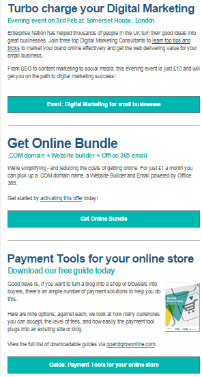
Take Enterprise Nation. I always read their newsletter. It is laid out simply in an easy-to-read format with no constant distractions from flashing images, numerous columns and varying colours and fonts.
On the other hand, and please forgive me those that love it, I cannot bear Dani Johnson’s. There is so much text with so many links I just do not know which way to look first. Trying to scan it fills me with dread as it initially appears as though it will take far too much time to go through everything, so I just delete and the other day finally unsubscribed.

I also have just unsubscribed from another newsletter that hits me with so many different fonts and colours (I only have a few shown on this screen print) that I start to feel a little nauseous each time I see it.

So before you get carried away with seeing how many columns, pictures and flashy bits you can fit into your newsletter, stop and think from the reader’s point of view.
We are all busy and tend to scan things to see if it is worth us taking our valuable time to read any further. Make it simple for the reader to see immediately the message you are trying to get across. Don’t put distractions in their way.
If you would like my ‘9 Top tips for effective newsletters’ simply drop me a comment below.


